| |
| Online Activities and Color
|
In the survey, questions
regarding the importance of a variety of online activities
(e.g. shopping & communicating,
to name a few) were asked, and this part of project will
focus on possible color combinations to help designers
make better color choices for using, or not using, specific
colors. To begin, let’s take a look at the reasons
people use the Internet. The graph below presents the survey
data for the questions regarding the importance of online
activities. The scores in this graph are averages of all
the results with no filters applied to age groups or gender.
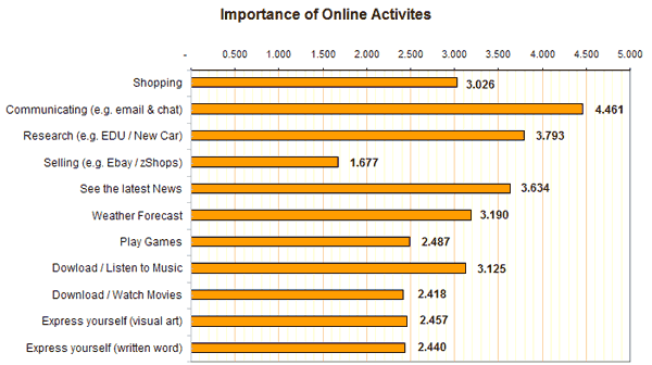
Figure
7.0 - Importance of Online Activities
As you can see, shopping, communicating,
research, news, weather, and downloading music are the
highest in the ranking. To tie in the discoveries listed
in the preceding pages, I’m going to suggest two
scenarios where an organization needs a new color scheme
for their web site. The first site is an online store that
caters to people who purchase children’s toys and
gifts. This e-commerce store only makes a small profit
on each transaction, so they need to move a lot of product
to maintain financial buoyancy. The second site is designed
for women with breast cancer. The site is owned by a non-profit
company and is made available for anyone who wants to
learn more about the disease, donate money to the cause,
and/or communicate with others who have suffered, or are
currently suffering, from the ailment. Although both organizations
use the Internet to communicate to their publics, their
goals are completely different.
The Toy Store
As we learned in the associations section
of this report, people associate several colors to the
word fun. Most of
which are the primary and secondary colors red, blue,
yellow, green, purple, and orange.
Cailin Boyle, who is mentioned in the education section
of this site, states in her book Color
Harmony for the Web that the use of bright and
highly saturated colors can help make a corporate identity
fun, accessible,
and exciting (Color
Harmony 130). Part of doing this would
be to use colors that are bright and full of energy.
Colors like red, orange and yellow all give off a high
level of energy and would bring an exciting atmosphere
to the project.
Alongside the need
to produce a site that’s
friendly, the online store needs to have a color combination
that promotes a quick transaction. Red is shown as
the major color choice when associated with speed on
the color associations section
of this site. Also, as stated in the psychology section,
the color red is known to affect the mental processes
of a human.
Although I don’t know if this is the absolute
truth, one could say from reading Birren that the use
of red would help take some of the contemplation out
of the decision. Getting people to find something and
quickly make a purchase is the goal of this store.
Boyle, in describing Neiman Marcus’s web site
design stated that they used bright color palettes
that create excitement about the new products…and
their medium created a sense of ongoing newness critical
for a successful e-commerce site (Color
Harmony 44). Yellow
is another color that can be relied on in this situation.
Although children tend to like the color yellow more
than adults do, the use of yellow is necessary to maintain
a child-like theme. Although we may not be conscious
of the popularity of this color and its dependence
on age, we all know that children tend to enjoy bright
and highly active colors.
Breast Cancer Awareness
The majority of people who have, or had, breast cancer
are female and tend to be older than 30 years of age. These
two criteria are fundamental when choosing a safe color
scheme for a topic of great importance. Luckily, this survey
consisted of 62% female participants. By looking at the
favorite colors by age group, the courage / bravery pie
chart, the fear / terror pie chart, and the fun pie chart
we can get a good idea of what colors to use. To begin,
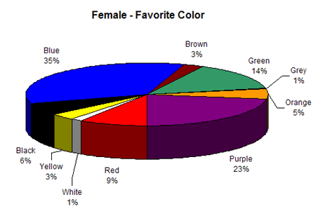
the bar graph for favorite color by age group and the
favorite color for female pie chart are listed below.
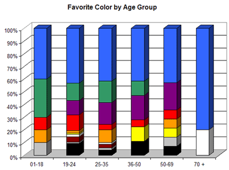
Figure
6.4 - Favorite Color by Age Group
Figure
6.2 - Female Favorite Color
As you can see, the
colors older females tend to favor are blue, purple
and green. From the studies
Birren performed, and written about in the associations section,
the preference section, and
the psychology section,
blue is known for being a favored color, but is also associated
with depression, gloom, and fearfulness
(Color
Psychology and Color Therapy, 143). Blue
also tends to be a cold and unenergetic color. For these
reasons alone, the heavy use of blue
may be a poor choice. Green represents life, nature and
restfulness, but also can be associated with guilt and
disease according to Birren. Purple is often associated
with dignity and courage, a combination of words that may
give hope to those with cancer. Below is the graph depicting
the survey results for courage and bravery.
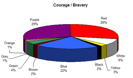
Figure
4.9 - Association with Courage / Bravery
As you can see red, purple, and blue all
play a role in the representation of courage and bravery.
Aside from courage and bravery, Red, according to the survey
participants, is closely associated with speed, fun, and
fear / terror. See below for the pie chart representing
the votes for fear and terror.
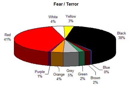
Figure
5.0 - Association with Fear / Terror
Red might be a color to avoid for a project
like this. The last thing we need is the users of a breast
cancer awareness site feeling a sense of fear or terror.
This leaves Purple as the best single choice for a color.
Different hues of purple include pink and magenta and are
currently included in many medical color schemes today
(http://www.komen.org/bci/ for example).
|